Granny Chic Dining Room: How I Transformed My Space with Vintage Charm
Contents
- Granny Chic Dining Room: How I Transformed My Space with Vintage Charm
- What Actually Is Granny Chic (And Why You’ll Love It)
- My Biggest Mistake (Don’t Do This)
- The Foundation: Furniture That Actually Matters
- Layering Textures Without Looking Like a Hoarder
- The Power of Floral Patterns (Yes, Really)
- Lighting That Creates Magic
- Book Your Stay
Granny chic dining room design has taken over my home, and honestly, I’ve never felt more at peace during dinner time.
My dining room used to feel cold and uninviting. You know that feeling when you walk into a space and it just doesn’t hug you back? That was my problem.
I’d scroll through Pinterest late at night, wondering why everyone else’s dining rooms looked like cozy sanctuaries while mine resembled a furniture showroom.
Then I discovered granny chic—or grandmacore, as the kids call it these days.
🖼 Steal This Look
- Paint Color: Sherwin-Williams Ripe Olive SW 6209
- Furniture: oval pedestal dining table with turned legs, mismatched Windsor and spindle-back chairs with cane seats, antique sideboard with scalloped mirror
- Lighting: brass sputnik chandelier with frosted glass globes or vintage-inspired schoolhouse pendant
- Materials: matte chippy wood, hand-crocheted lace, faded floral chintz, tarnished brass, weathered cane, grain sack linen
I found my best pieces at estate sales where I could practically smell the Sunday roasts that happened around them—those scratches and water rings tell stories you’ll never get from new furniture.
What Actually Is Granny Chic (And Why You’ll Love It)
Listen, granny chic isn’t about making your home look like an actual grandma lives there. It’s about capturing that warm, lived-in feeling that grandmother’s homes always had.
The style combines:
- Vintage nostalgia with modern practicality
- Soft floral patterns that don’t scream “nursing home”
- Aged finishes that tell stories
- Handmade touches that add soul
I’m talking about the kind of space where you actually want to linger after dinner, not bolt for the living room.
My Biggest Mistake (Don’t Do This)
I almost gave up before I started.
Why?
Because I thought granny chic meant spending thousands on genuine antiques. I imagined hiring estate sale scouts and competing with professional collectors.
Wrong.
The beauty of this style is that secondhand finds and thrift store treasures work better than expensive reproductions.
That slightly wobbly chair with the scratched legs? Perfect.
Those mismatched teacups you almost passed by at the flea market? Exactly what you need.
★ Steal This Look
- Paint Color: Farrow & Ball De Nimes No.299
- Furniture: mismatched Windsor and balloon-back dining chairs with visible wear
- Lighting: brass swing-arm wall sconce with pleated silk shade
- Materials: distressed oak, faded velvet, crazed ceramic, tarnished brass
I learned this the hard way after blowing my budget on one ‘perfect’ antique hutch that looked staged, not storied.
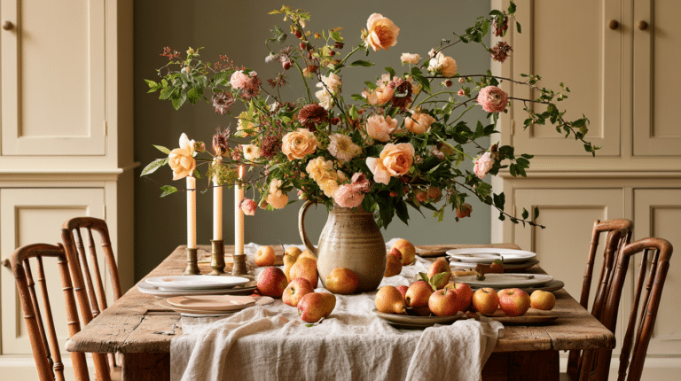
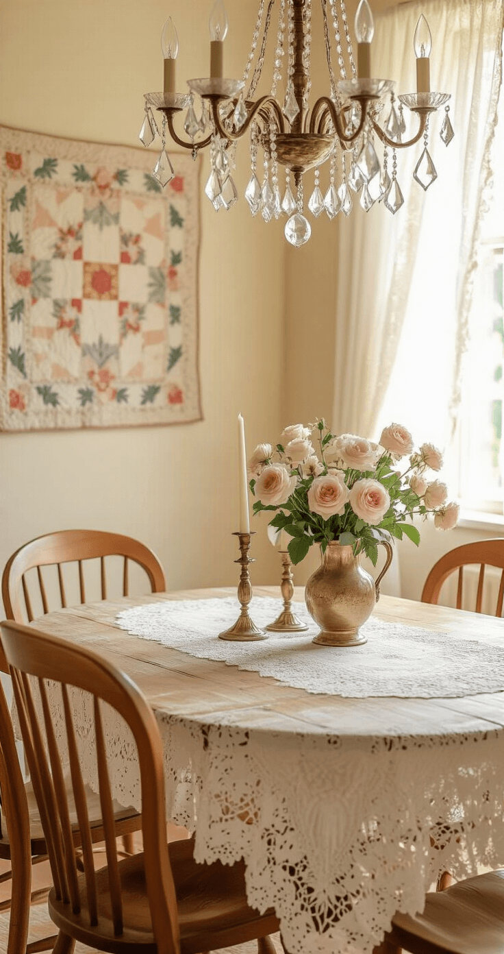
The Foundation: Furniture That Actually Matters
The Dining Table
Your table sets the entire mood.
I found mine at a local estate sale for $150. It had water rings, scratches, and a wonky leg that my partner fixed in twenty minutes.
What to look for:
- Solid wood (not veneer—you’ll regret that)
- Visible wear that adds character
- A finish you can live with or easily refresh
Don’t overthink this. If the table makes you want to sit down and stay awhile, it’s the right one.
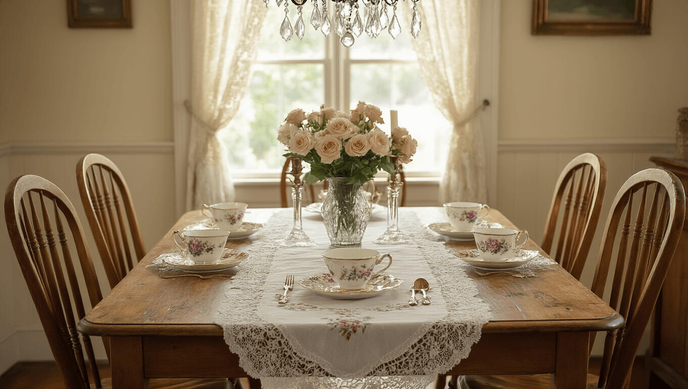
Chairs That Tell Stories
This is where I got creative.
Instead of buying a matching set, I collected vintage wooden dining chairs from three different sources over two months.
Two came from Facebook Marketplace. One was my actual grandmother’s rocking chair. Three others came from a church rummage sale.
The magic formula:
- Solid wood construction with turned legs
- Paddle-shaped spindles or upholstered seats
- Slightly different but complementary styles
- Finishes that work together (mine range from honey oak to cream)
My friend Sarah visited last month and said, “These chairs look like they’ve hosted a hundred family dinners.”
They had. Just not mine.
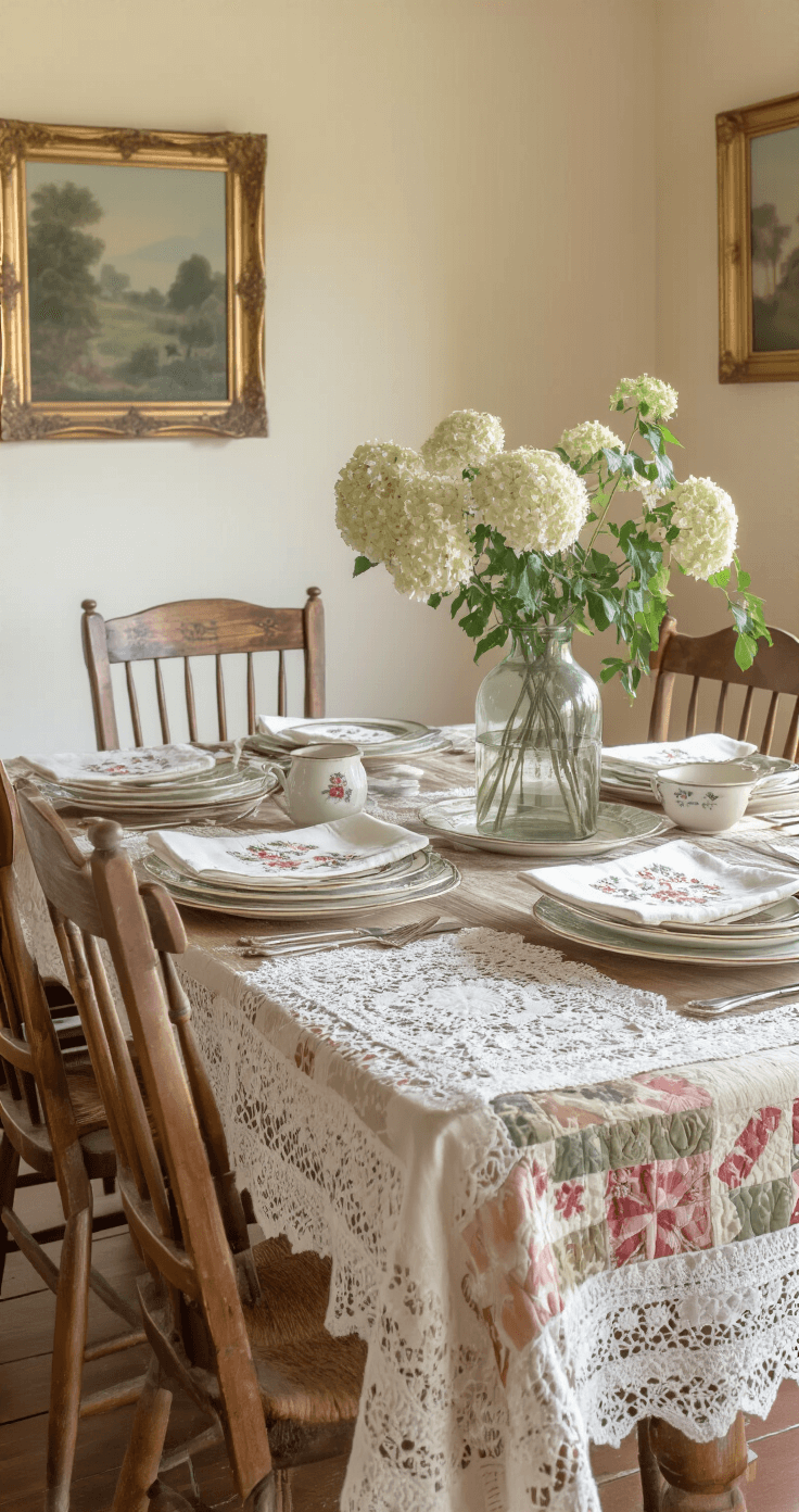
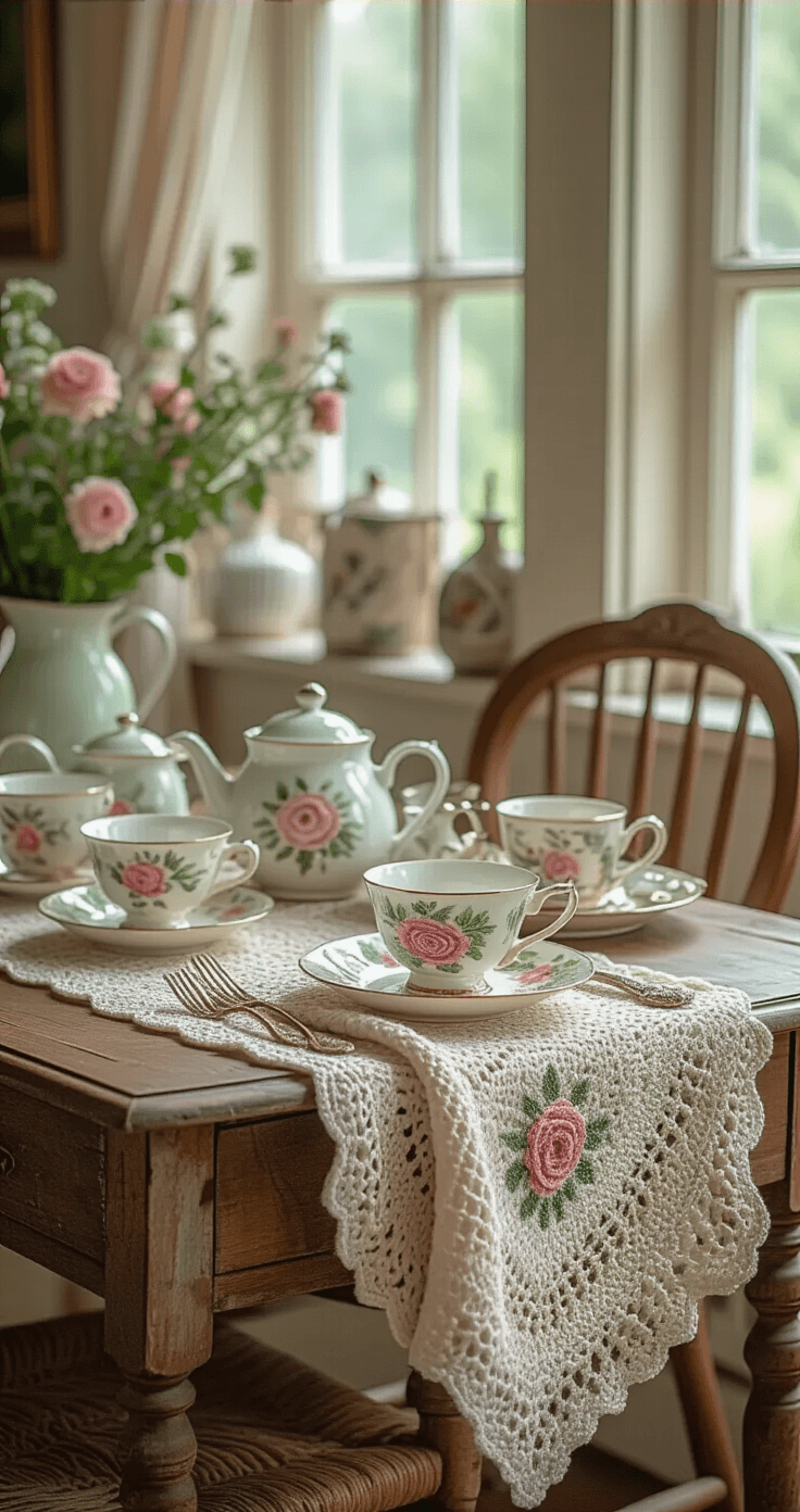
Layering Textures Without Looking Like a Hoarder
This is where granny chic gets tricky.
The style celebrates abundance, but there’s a line between cozy and cluttered.
My layering system:
Start with your table base. I use a vintage lace tablecloth as the foundation.
Then add a runner down the center. Mine has embroidered roses that my grandmother’s friend made decades ago.
On top of that, I layer:
- Mismatched vintage plates (florals and pastels)
- Delicate teacups from thrift stores ($1 to $3 each)
- Old silverware with tarnished charm
- Lace doilies under centerpieces
The trick is intentional imperfection.
Everything should look like it’s been loved, not like you’re trying too hard.
★ Steal This Look
- Paint Color: use Valspar brand. Match the ACTUAL wall color in the image. Format: Valspar ColorName CODE
- Furniture: oval farmhouse dining table with turned legs, painted in chippy sage green or left raw with patina
- Lighting: vintage brass chandelier with fabric-wrapped cords and candle-style bulbs
- Materials: linen, crocheted cotton, tarnished silver, hand-thrown ceramic, distressed wood
I learned this the hard way when my first granny chic table looked like a yard sale exploded—now I photograph each layer from above before guests arrive, and if anything feels ‘precious,’ it comes off.
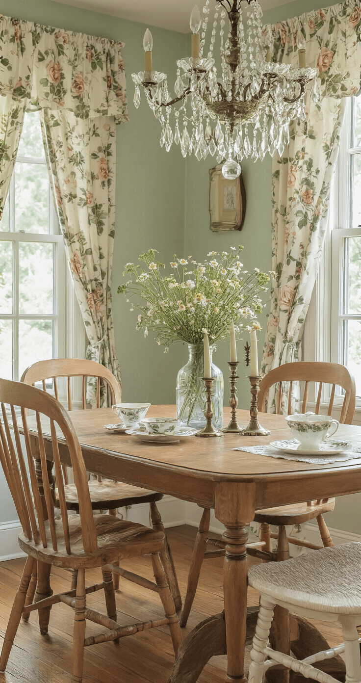
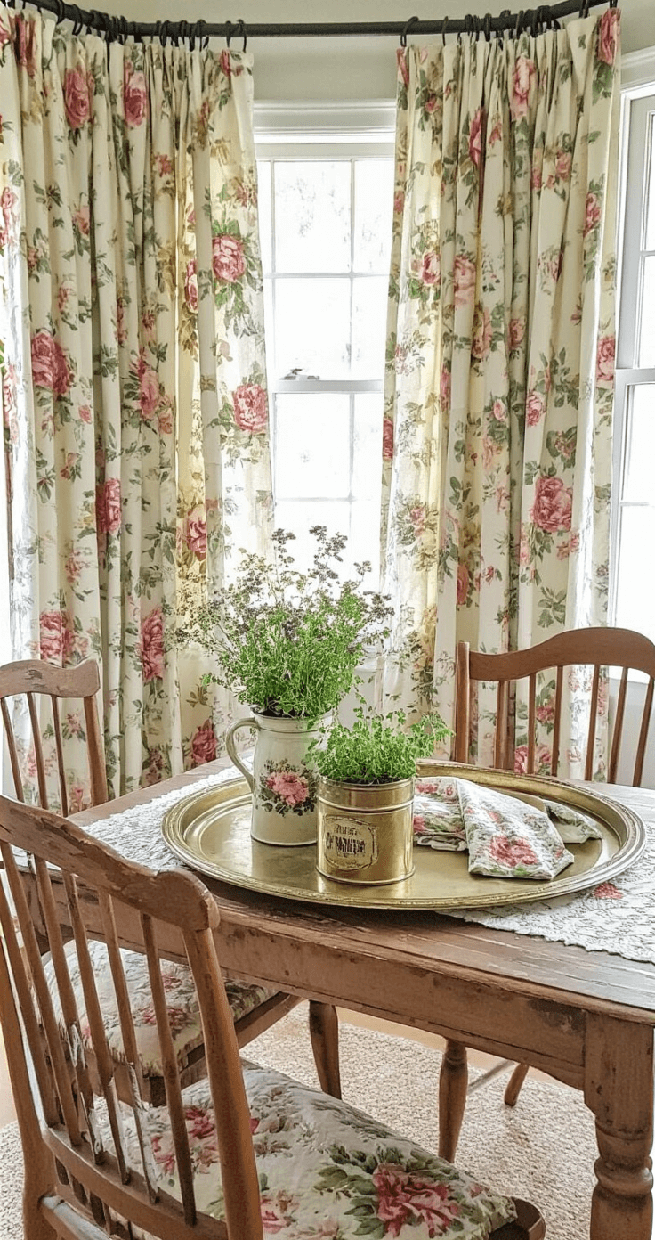
The Power of Floral Patterns (Yes, Really)
I used to hate floral patterns.
They reminded me of waiting rooms and outdated wallpaper.
Then I learned the secret: layer different floral scales and styles together.
Here’s what works in my space:
Large florals:
- Window curtains with cabbage roses
- An upholstered chair with oversized daisy patterns
Medium florals:
- Table linens with scattered wildflowers
- Vintage floral throw pillows on a nearby bench
Small florals:
- Teacups with tiny rose sprigs
- Napkins with delicate prints
Pro move: Mix florals with solid colors in complementary tones. My cream walls balance the pattern overload perfectly.
★ Steal This Look
- Paint Color: PPG Delicate White PPG1001-1
- Furniture: curved-back upholstered dining chair with oversized floral fabric
- Lighting: brass semi-flush mount with frosted glass shade and subtle petal detailing
- Materials: linen curtain panels, chintz upholstery, embroidered cotton table linens, glazed ceramic with hand-painted florals
This approach transformed my own dining room from stuffy to soulful—there’s something deeply comforting about surrounding yourself with blooms that never wilt.
Lighting That Creates Magic
Harsh overhead lighting
Book Your Stay
This post may contain affiliate links. Please see my disclosure policy for details.