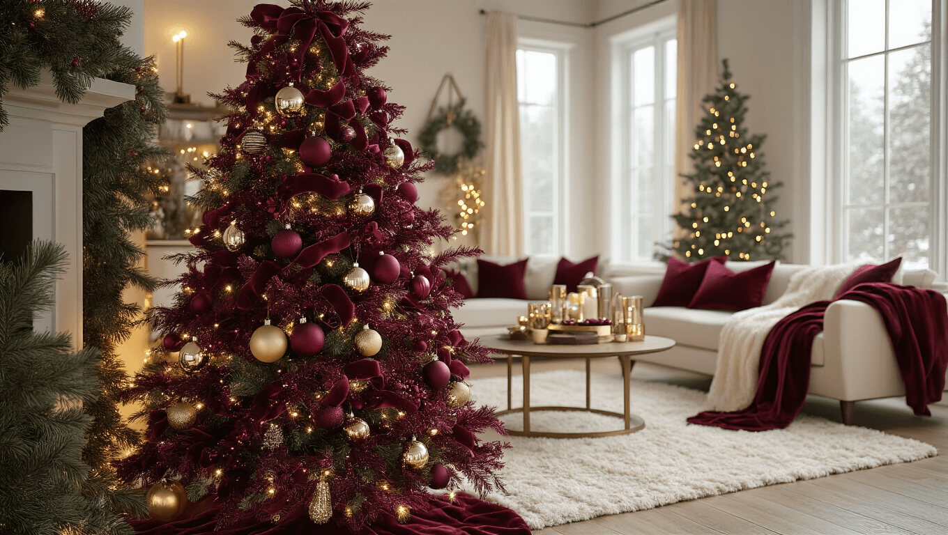
How to Create a Burgundy Christmas That Doesn’t Look Like Your Grandmother’s Parlor
Contents
Burgundy Christmas decorating is my secret weapon for creating a holiday look that feels grown-up without being stuffy.
I stumbled into this color scheme three years ago when I couldn’t find the bright red ornaments I wanted and grabbed burgundy ones instead. Best decorating accident of my life.
Now I’m that person friends text photos to asking “is this the right shade of burgundy?” while standing in Target’s holiday aisle.

✎ Steal This Look
- Paint Color: Sherwin-Williams Urbane Bronze SW 7048
- Furniture: low-profile velvet sofa in charcoal or deep navy, mid-century walnut credenza, brass-accented coffee table with clean lines
- Lighting: sputnik chandelier with aged brass finish and dimmable LED bulbs
- Materials: matte black metal, warm walnut wood, brushed brass, chunky knit wool, raw linen, seeded glass
I learned this the hard way after my first burgundy Christmas looked like a Victorian funeral until I stripped away the fussy extras and let the color breathe against darker, cleaner backgrounds.
Why Burgundy Hits Different Than Regular Red
Burgundy brings sophistication that screams “I have my life together” even when you’re eating cereal for dinner. The deep wine tones create warmth without the visual punch-in-the-face that cherry red delivers.
This isn’t about ditching tradition—it’s about elevating it.
Here’s what makes burgundy work:
- Creates depth that standard red can’t match
- Pairs beautifully with almost any existing decor style
- Photographs incredibly well (your Instagram will thank me)
- Feels expensive regardless of your actual budget
- Works year-round with minor tweaks
I spent about $150 my first year and have added maybe $50 annually since then. The investment pays off because burgundy doesn’t scream “CHRISTMAS” so aggressively that you need to pack everything away December 26th.

🖼 Steal This Look
- Paint Color: Benjamin Moore Deep Burgundy 2075-10
- Furniture: velvet channel-tufted sofa in merlot or oxblood
- Lighting: aged brass pharmacy floor lamp with burgundy silk shade
- Materials: velvet, aged brass, raw walnut, matte black iron, wool bouclé
I’ve watched friends panic-buy burgundy throws in November only to realize they clash with everything; the trick is starting with one investment piece you actually live with, not seasonal props that feel disposable.
The Non-Negotiable Foundation Pieces
Start with burgundy Christmas ornaments in multiple finishes. This matters more than people think.
Get these finishes specifically:
- Matte burgundy for sophistication
- Glossy burgundy for light reflection
- Velvet burgundy for texture depth
- Mercury glass in burgundy for vintage appeal
I learned the hard way that buying all the same finish makes your tree look flat and one-dimensional. Mix sizes too—from golf ball to softball dimensions creates visual interest that pulls the eye around rather than letting it glaze over.
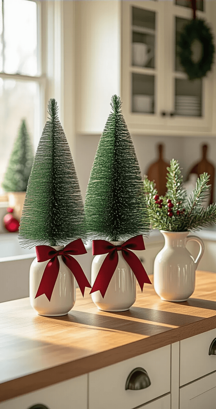
Greenery is your backbone. I use artificial Christmas garland because I’m not watering real garland in three different rooms for a month.
Greenery that actually works:
- Cedar garland for that classic Christmas scent (if real) or realistic look (if fake)
- Eucalyptus picks for subtle silver-green contrast
- Berry-filled branches in burgundy and cream tones
- Pine branches with long needles for dramatic texture
Velvet ribbon in burgundy becomes your connecting thread. I buy burgundy velvet ribbon in bulk—the 2.5-inch width works for most applications.
Cheap satin ribbon looks cheap. Velvet looks intentional even when you’re winging it.

The Color Combinations That Actually Work
Burgundy needs friends, but not just any friends.
Your primary palette:
- Deep burgundy as your star
- Creamy white (not stark white—that’s too harsh)
- Soft gold for warmth without bling overload
- Forest green for natural depth
I made the mistake year one of adding silver because I had it. Silver makes burgundy look muddy and confused. Gold makes it look rich and purposeful.
Secondary accents that elevate:
- Rust orange in small doses
- Sage green for softness
- Cream and tan through natural textures
- Touches of deep plum for dimension
The ratio matters: roughly 60% burgundy and cream, 30% green, 10% gold. This keeps burgundy dominant without overwhelming your space.

Building Your Tree Like You Mean It
I start with lights—warm white only. Cool white makes burgundy look purple and sad.
String lights deep into branches, not just on tips. This creates depth when you add everything else.
Layer in this specific order:
- Greenery picks with berries pushed deep into the tree
- Largest ornaments positioned throughout (not just bottom)
- Medium ornaments filling gaps
- Smallest ornaments as jewelry pieces
- Ribbon treatment last
For ribbon, I cut 2-3 yard lengths and create loose loops that cascade down rather than wrapping around. Tuck ends into branches rather than creating bows—this looks more organic and less craft-fair.
Ornament clustering technique:
Group 3-5 ornaments of varying sizes close together rather than spacing them evenly. This creates focal points your eye travels to instead of that sad evenly-spaced look that screams “I followed spacing rules from 1987.”
I use about 100 ornaments on my 7-foot tree. Yes, that’s more than the box recommendations. Boxes lie.
Mantel Styling That Doesn’t Slide Off
Your mantel needs a hero piece. Mine is Christmas garland with lights pre-lit so I’m not dealing with separate light strings.
Build your mantel in layers:
- Base layer: Garland draped with intentional swoops (not pulled tight like dental floss)
- Mid layer: Burgundy elements tucked into the garland—large ornaments, berry picks, pine cones painted burgundy
- Top layer: Candles in varying heights with burgundy accents
I learned that symmetry looks formal and forced. Asymmetrical arrangements look collected and interesting.
Stockings deserve better:
🎨 Steal This Look
- Paint Color: Farrow & Ball Rectory Red 217
- Furniture: A vintage-leaning velvet Chesterfield sofa in deep charcoal or forest green to anchor the living room without competing with burgundy holiday accents
- Lighting: A brass and glass globe pendant with warm 2700K dimmable LEDs to cast flattering amber light that makes burgundy ornaments glow like jewels
- Materials: Matte ceramic, hand-blown glass, crushed velvet, antiqued mercury glass, and preserved cedar branches with realistic needle texture
I still remember my first ‘grown-up’ Christmas tree—every ornament was the same matte burgundy from a craft store clearance bin, and it looked like someone had draped a wine-colored sheet over a cone; that failure taught me that intentional finish mixing is what separates amateur from intentional holiday design.
This post may contain affiliate links. Please see my disclosure policy for details.