Christmas Home Decor Ideas That’ll Make Your Home Feel Like a Festive Wonderland
Contents
- Christmas Home Decor Ideas That’ll Make Your Home Feel Like a Festive Wonderland
- Why Your Christmas Decor Might Be Falling Flat
- Start With Your Color Story (Or Watch Everything Clash)
- The Garland Game-Changer Nobody Talks About
- Your Mantel Deserves Better Than Random Stuff
- The Tree Situation: Size Isn’t Everything
Christmas home decor ideas can transform even the dreariest space into something that makes your heart skip a beat every time you walk through the door.
I’ve spent years experimenting with holiday decorating—some attempts brilliant, others looking like a craft store exploded in my living room.
Let me save you from my mistakes and share what actually works.

💡 Steal This Look
- Paint Color: Sherwin-Williams Alabaster SW 7008
- Furniture: slipcovered linen sofa in natural ivory, reclaimed wood coffee table with turned legs
- Lighting: oversized wrought iron chandelier with candle-style LED bulbs and dimmer switch
- Materials: plaid wool throws, mercury glass votives, fresh cedar garlands, aged brass accents
There’s something about that first evening when the tree lights go on and the house smells like pine that makes all the decorating chaos worth it—this is the room where those memories actually happen.
Why Your Christmas Decor Might Be Falling Flat
You’ve got the tree up. You’ve strung some lights. But something feels off, doesn’t it?
The room looks cluttered instead of cozy. Nothing feels cohesive. Your Pinterest board mocks you with its impossibly perfect spaces.
Here’s the truth: most people make Christmas decorating harder than it needs to be.
They buy random pieces without a plan. They overcrowd surfaces thinking more equals festive. They ignore the basics that make designer spaces sing.
I’m going to fix that for you right now.

✎ Steal This Look
- Paint Color: Benjamin Moore White Dove OC-17
- Furniture: low-profile linen slipcovered sofa in natural oatmeal, paired with a reclaimed wood coffee table with visible grain and patina
- Lighting: oversized woven rattan pendant or aged brass chandelier with dimmable Edison bulbs
- Materials: unbleached Belgian linen, raw oak, hand-thrown ceramics, vintage wool blankets, foraged greenery
I’ve walked into too many living rooms where the homeowner clearly exhausted themselves by December 15th, and you can feel that fatigue in the space itself—your guests notice when decorating becomes a chore rather than a joy.
Start With Your Color Story (Or Watch Everything Clash)
Pick three colors maximum. That’s it. Three.
I learned this the hard way after my 2019 “rainbow explosion” phase that made my living room look like a Christmas clearance aisle.
Here’s what works:
Classic combinations:
- Deep forest green + burgundy + cream
- Navy blue + silver + white
- Emerald green + gold + ivory
Modern twists:
- Blush pink + copper + sage green
- Charcoal gray + brass + natural wood tones
- Peacock blue + champagne gold + dove gray
Once you’ve chosen, every single item you bring in should fit this palette.
Your Christmas throw pillows matter. Your ribbon matters. Even your wrapping paper matters if it’s going under the tree as decor.

✎ Steal This Look
- Paint Color: Farrow & Ball Green Smoke 47
- Furniture: low-profile linen sofa in natural oatmeal
- Lighting: antique brass picture light with cream linen shade
- Materials: velvet, aged brass, raw linen, eucalyptus garlands
I still wince at photos of my 2019 living room—four competing reds, two incompatible greens, and a metallic gold that clashed with everything. That embarrassment taught me restraint is actually the more generous choice for guests’ eyes.
The Garland Game-Changer Nobody Talks About
Garlands are your secret weapon. But most people use them wrong.
I used to drape one sad garland across my mantel and call it done. Now I layer them like a fancy dessert.
Here’s my three-layer formula:
Layer 1: The Foundation
Start with fresh or realistic faux greenery garland as your base. Drape it generously—no skimpy strands that show gaps. Let it cascade naturally with curves, not pulled tight like you’re stretching a rubber band.
Layer 2: The Texture
Add ribbon in your chosen colors. Weave it through the greenery. Let it loop and cascade—controlled chaos is the goal.
Layer 3: The Personality
This is where you get specific to your style:
- Tuck in pinecones and berry sprigs for rustic vibes
- Wire in ornaments that match your tree for cohesion
- Add battery-operated fairy lights for evening magic
I did this on my staircase last year and guests literally stopped mid-conversation to photograph it.
★ Steal This Look
- Paint Color: Behr Soft Focus PPU18-09
- Furniture: a substantial wood mantel shelf with corbels, deep enough to support cascading garland without looking overcrowded
- Lighting: picture lights mounted above the mantel to uplight the garland layers and cast warm shadows through the greenery
- Materials: mixed evergreen garland with varied needle lengths, wired velvet ribbon, natural pinecones with faux snow flocking, and matte glass ornaments
I learned this layering trick after years of my mantel looking like a green snake had died on it—now it’s the first thing guests photograph when they visit during the holidays.
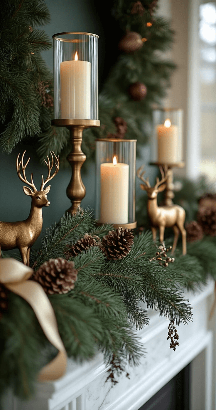
Your Mantel Deserves Better Than Random Stuff
I see mantels that look like someone just placed things until they ran out of surface.
Stop that.
The designer formula is this simple:
Create height variation using the rule of threes:
- One tall element (candlesticks, lanterns, or tall greenery)
- One medium element (framed art, smaller arrangements)
- One low element (votives, small ornaments, scattered greenery)
Work in odd-numbered groupings:
Three candlesticks look intentional. Two look like you forgot to buy the third. Four looks like you’re trying too hard.
Leave breathing room:
White space isn’t wasted space. It’s what makes everything else look expensive instead of cluttered.
Here’s what I did last Christmas:
- Large hurricane candle holders on each end (with real candles because I’m not a monster)
- Fresh greenery garland draped across with cascading ribbon
- Three brass deer figurines in graduating sizes in the center
- Small glass ornaments scattered between elements
Cost me under $80. Looked like I hired someone.

🖼 Steal This Look
- Paint Color: use Valspar brand. Match the ACTUAL wall color in the image. Format: Valspar ColorName CODE
- Furniture: specific furniture for this room
- Lighting: specific lighting fixture
- Materials: key textures and materials
1-2 sentences of human framing about this room
🔔 Get The Look
The Tree Situation: Size Isn’t Everything
Multiple small trees beat one massive tree you can’t properly decorate.
This was revolutionary for me.
Instead of one seven-foot tree I could barely reach the top of, I now use:
- One main tree in the living room (six feet, manageable)
- One slim pencil tree in the entryway (four feet, huge impact for the space)
- One tabletop tree in the kitchen (two feet, ridiculously charming)
Each tree has its own mini color story within my overall palette.
The living room tree gets the full treatment. The entryway tree stays monochromatic and elegant. The kitchen tree is where I let loose with quirky ornaments that don’t fit elsewhere.
Pro move: Use different tree skirt alternatives for visual interest. I put my entryway tree in a galvanized bucket filled with epsom salt (looks like snow). Cost: $6. Compliments: countless.

★ Steal This Look
- Paint Color: use PPG brand. Match the ACTUAL wall color in the image. Format: PPG ColorName CODE
- Furniture: slim pencil tree in entryway, tabletop tree in kitchen, galvanized bucket tree base alternative
- Lighting: warm white string lights on multiple trees for layered glow
- Materials: galvanized metal, epsom salt filler, varied tree skirt alternatives like woven baskets or wooden crates
I learned this the hard way after wrestling with one oversized tree for years—my back and my sanity both prefer this scattered approach, and guests now wander through my home genuinely surprised by each new tree they discover.
This post may contain affiliate links. Please see my disclosure policy for details.