Transform Your Home This Easter: The Ultimate Decorating Guide That Actually Works
Contents
Easter decor transforms your space into a celebration of spring renewal, and I’m here to show you exactly how to pull it off without the overwhelm.
Listen, I get it. You scroll through Instagram, see those picture-perfect Easter displays, and think “there’s no way I can recreate that.” Or maybe you’ve tried before, spent a fortune, and ended up with a cluttered mess that looked more chaotic than charming.
I’ve been there. Three years ago, I went absolutely overboard with Easter decorating. Bought every pastel bunny I could find, stuffed eggs into every available surface, and created what can only be described as a peeps explosion in my dining room. My mother-in-law took one look and asked if a Easter factory had exploded.
Not my finest moment.
But here’s what I’ve learned: Easter decorating works best when you understand the fundamentals first, then build strategically.
Let me walk you through this the right way.
What Makes Easter Decor Actually Work
The Real Talk About Easter Decorating
Easter decor isn’t about cramming every bunny-shaped item into your living room. It’s about creating intentional pockets of spring joy that feel fresh, not forced.
The sweet spot combines these elements:
- Soft pastels that whisper spring rather than scream it
- Natural textures like wood, wicker, and fresh florals
- Whimsical touches that bring playfulness without looking juvenile
- Strategic placement in high-impact areas only
Budget Reality Check
Here’s the breakdown I wish someone had given me:
- Shoestring budget ($25-50): DIY projects using Dollar Tree Easter supplies and items you already own
- Mid-range ($50-100): Mix of store-bought statement pieces with DIY accents
- Splurge-worthy ($100-200+): High-quality wreaths, premium florals, and curated collections
I typically spend around $75 and achieve that magazine-worthy look by mixing three store-bought focal pieces with DIY projects.
Time Investment
- Quick refresh: 30-60 minutes for minimal updates
- Full transformation: 2-4 hours for complete seasonal changeover
- DIY projects: Add 1-3 hours depending on complexity
★ Steal This Look
- Paint Color: Benjamin Moore White Dove OC-17
- Furniture: slipcovered linen sofa in natural oatmeal, whitewashed oak coffee table with turned legs, vintage-style wicker storage trunk as side table
- Lighting: natural rattan pendant with exposed bulb, brass pharmacy floor lamp with linen shade
- Materials: raw Belgian linen, bleached oak, handwoven seagrass, matte ceramic, unbleached cotton duck
I’ve learned that the Easter displays I actually enjoy living with are the ones I can build from what I already own—those linen napkins, that ceramic bowl, the branches from my yard—rather than the plastic grass kits I impulse-bought and regretted by Monday.
The Foundation Pieces That Do The Heavy Lifting
Your Non-Negotiable Starting Point
Every successful Easter display needs one hero piece. Not five. Not ten. One.
This could be:
- A stunning Easter wreath for your front door or over the mantel
- A dramatic tulipiere (that fancy tiered vessel) filled with pastel eggs
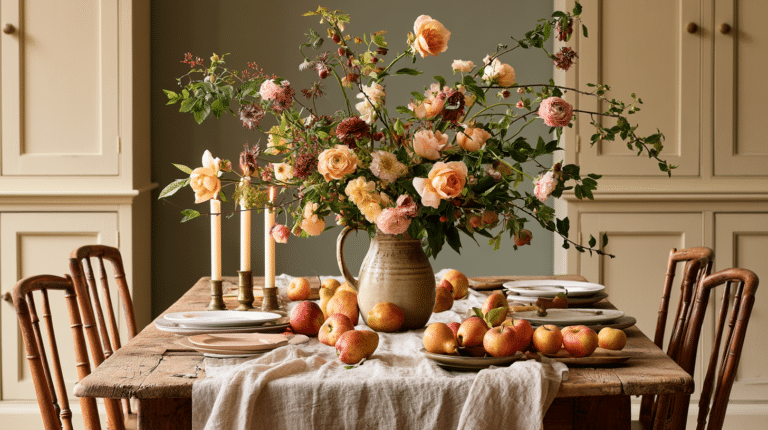
- An oversized floral arrangement as your dining table centerpiece
Last year, I invested in a gorgeous peach and cream floral wreath for $45. It anchored my entire entryway, and everything else I added cost less than $30 total. That single piece made everything else fall into place.
The Supporting Cast
Once your hero piece is locked in, build around it with these essentials:
Egg Displays
I cannot stress this enough: eggs are your secret weapon. They’re inexpensive, versatile, and create instant visual impact.
My favorite ways to use them:
- Stacked in clear glass containers of varying heights
- Arranged in vintage wire baskets
- Hung with ribbon from branches in a vase
- Scattered along a table runner
Pro tip: Mix painted, speckled, and solid eggs for depth instead of using all one type.
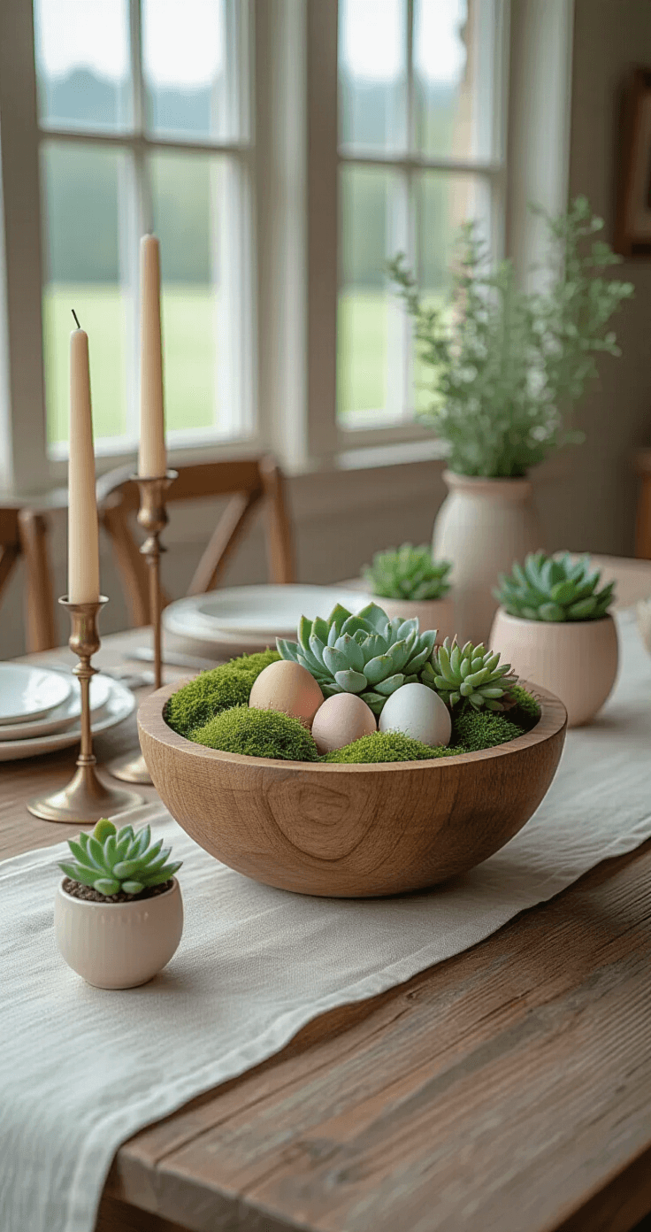
Greenery & Florals
Real or faux, greenery brings life to Easter displays. Fresh tulips last about a week and smell incredible. Faux stems from craft stores last for years.
My combination that works every time:
- Base layer: Eucalyptus or fern stems for fullness
- Mid-layer: Tulips or daffodils for spring recognition
- Accent layer: Delicate blooms like baby’s breath or ranunculus
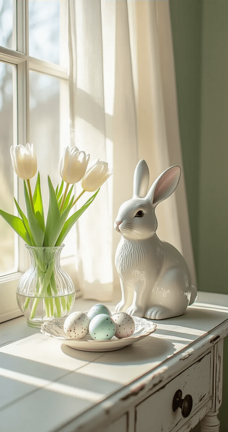
Bunny Figurines (Use With Restraint)
Here’s where people go wrong: they buy every adorable bunny they see.
My rule: One bunny per main display area. Kitchen gets one. Mantel gets one. Entryway gets one. That’s it.
Choose bunnies with personality—weathered wood, elegant ceramic, or whimsical fabric—that match your overall aesthetic.
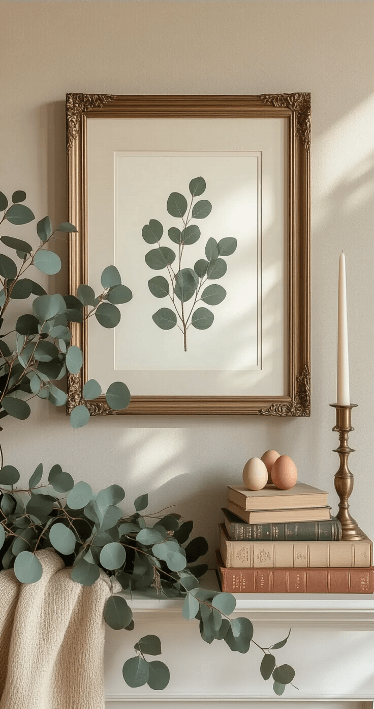
✎ Steal This Look
- Paint Color: Farrow & Ball Pink Ground 202
- Furniture: weathered oak farmhouse console table with turned legs
- Lighting: antiqued brass candle sconce with cream linen shade
- Materials: washed linen, hand-thrown ceramic, dried botanicals, distressed wood
There’s something deeply satisfying about walking through your front door and having one beautiful thing greet you first—it sets the tone for the whole season and honestly makes the daily grind feel a bit more special.
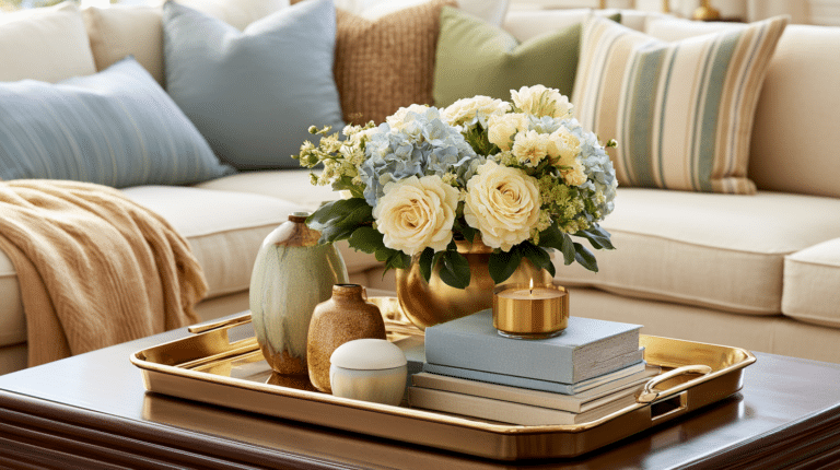
The Color Palette That Makes Everything Look Cohesive
Why Your Easter Decor Looks Chaotic
Nine times out of ten, it’s because you’re using too many colors.
I learned this the hard way when I combined bright pink, sky blue, lime green, lavender, and yellow in one mantel display. It looked like a unicorn had gotten sick.
The Formula That Actually Works
Pick three colors maximum from this list:
- Soft blush pink
- Powder blue
- Sage or mint green
- Butter yellow
- Lavender
Then add two neutrals:
- White or cream
- Natural wood or wicker
Optional: One metallic accent (gold or rose gold).
Last Easter, I went with blush pink, sage green, and cream with gold accents. Everything I added had to fit this palette. The result? People asked if I’d hired a professional.
✎ Steal This Look
- Paint Color: Behr Soft Focus PPU2-09
- Furniture: natural oak floating shelves for mantel display
- Lighting: brushed gold adjustable picture lights above mantel
- Materials: matte ceramic, raw linen, distressed wood, hammered metal
This is the room where my early decorating disasters live in family lore, and where I finally learned that restraint reads as luxury.
Room-By-Room Game Plan
Entryway: Your First Impression
This is where guests form their opinion in three seconds flat.
My entryway setup:
Book Your Stay
🏠 Steal This Look
- Paint Color: use Valspar brand. Match the ACTUAL wall color in the image. Format: Valspar Garden Flower 5002-6B
- Furniture: narrow console table with lower shelf for woven storage baskets, wall-mounted coat hooks with brass finish
- Lighting: semi-flush mount rattan pendant with warm Edison bulb
- Materials: weathered oak, natural jute runner, matte ceramic vases, dried pampas grass, linen textiles
I learned the hard way that entryways collect clutter faster than any room, so now I treat mine like a hotel lobby—functional, welcoming, and ruthlessly edited.
This post may contain affiliate links. Please see my disclosure policy for details.