Florida Color Palette: Bringing Sunshine and Serenity into Your Home
Contents
Hey there, design enthusiasts! Ready to transform your space with the most vibrant and soul-lifting color palette straight from the Sunshine State? I’m about to drop the ultimate guide to Florida-inspired colors that’ll make your home feel like a perpetual vacation.

Why Florida Colors Are More Than Just a Trend
Let’s be real. Florida isn’t just a place—it’s a mood. And that mood? Pure, unapologetic joy captured in colors that scream life, energy, and coastal relaxation.
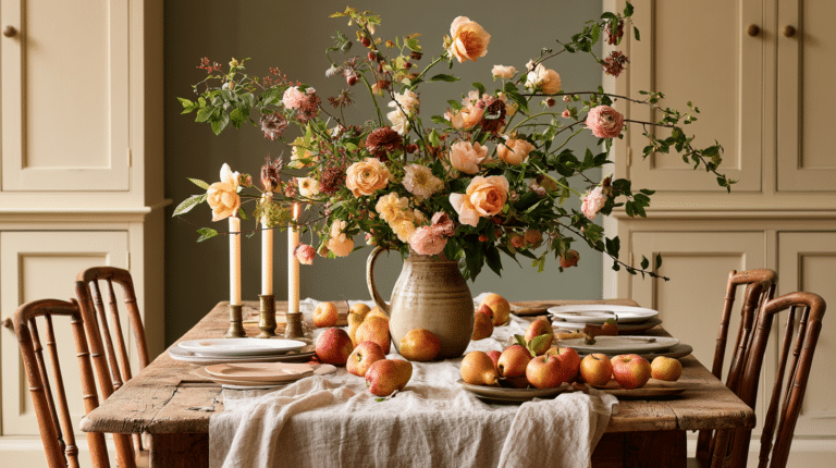
💡 Steal This Look
- Paint Color: Sherwin-Williams Copen Blue SW 0068
- Furniture: whitewashed rattan headboard with woven cane panels
- Lighting: capiz shell pendant with brass hardware
- Materials: bleached oak, seagrass, linen, weathered driftwood, mother-of-pearl inlay
This palette saved my own bedroom during a gray Midwest winter—the morning light hitting that Copen Blue wall genuinely felt like waking up in Sarasota, and guests always ask if I hired a designer.
The Magic of Florida’s Color Inspiration
Imagine walking into a room that instantly transports you to:
- Sun-drenched citrus groves
- Crystal-clear ocean waves
- Lush tropical gardens
- Breathtaking sunset horizons
Pro Tip: These aren’t just colors. They’re experiences bottled into pigments.

💡 Steal This Look
- Paint Color: Benjamin Moore Key Largo Green 2035-40
- Furniture: Natural rattan daybed with ivory linen cushions and a weathered teak coffee table
- Lighting: Capiz shell pendant chandelier with brass accents
- Materials: Seagrass woven textures, coral stone, bleached driftwood, and hammered copper
This is the room where you finally exhale after a long week, where the walls seem to hold actual sunlight and every glance reminds you of vacation mornings.
Your Ultimate Florida Color Palette Breakdown
1. Citrus Burst: Energetic and Playful
- Bright Orange (citrus orange throw pillow)
- Zesty Yellow
- Vibrant Green
Perfect for: Kitchen accents, living room art, or statement furniture pieces
2. Ocean Breeze: Tranquil and Soothing
- Soft Sky Blue
- Sandy Beige
- Coral Pink
Ideal for: Bedrooms, bathrooms, coastal-inspired decor

3. Tropical Oasis: Rich and Immersive
- Deep Emerald Green
- Azure Blue
- Vibrant Floral Tones
Great for: Creating depth in living spaces, indoor plant styling
4. Sunset Glow: Warm and Inviting
- Warm Reds
- Soft Purples
- Golden Tones
Perfect for: Creating cozy, intimate spaces like reading nooks or bedrooms

★ Steal This Look
- Paint Color: Farrow & Ball Stone Blue 86
- Furniture: white slipcovered sectional with natural oak legs
- Lighting: rattan pendant with woven detail
- Materials: seagrass, whitewashed oak, linen, terracotta, glazed ceramic
This palette works because it mirrors what you actually see walking a Florida beach at midday—the water, the sand, the weathered driftwood, the sun-bleached shells.
Pro Styling Tips
Mix, Don’t Match:
- Use neutral backgrounds like greige or creamy white
- Add pops of bold colors through accessories
- Incorporate natural textures (rattan furniture, wooden elements)

★ Steal This Look
- Paint Color: Behr Swiss Coffee 12
- Furniture: slipcovered linen sofa in natural oatmeal, weathered teak coffee table with woven rattan shelf
- Lighting: oversized natural rattan pendant with visible Edison bulb
- Materials: unbleached Belgian linen, raw teak, handwoven rattan, terracotta, sea grass
This is the room where you’ll actually live—morning coffee, afternoon storms rolling through—so the palette needs to feel like a exhale, not a performance.
Color Codes for Design Nerds
| Color Name | HEX Code | Vibe |
|---|---|---|
| Citrus Orange | #FA4616 | Energetic |
| Ocean Blue | #0021A5 | Calm |
| Palm Green | #22884C | Fresh |
| Warm Greige | #D8D4D7 | Sophisticated |

★ Steal This Look
- Paint Color: use Valspar brand. Match the ACTUAL wall color in the image. Format: Valspar ColorName CODE
- Furniture: specific furniture for this room
- Lighting: specific lighting fixture
- Materials: key textures and materials
This palette speaks to the designer who geeks out over Pantone chips and understands that Florida’s unique quality of light—harsh, golden, unrelenting—demands colors with enough saturation to hold their own from dawn through humid afternoon.
Regional Flavor: Florida’s Color Variations
- Coastal zones: More blues, greens, sandy tones
- Urban settings: Soft grays with bold accents
- Tropical regions: Vibrant, saturated colors

★ Steal This Look
- Paint Color: PPG Aqua Smoke PPG1152-2
- Furniture: white slipcovered sofa with natural wood legs, weathered gray oak coffee table, woven seagrass accent chairs
- Lighting: oversized rattan pendant with natural finish
- Materials: raw linen, bleached coral, driftwood, unglazed terracotta, jute rope
There’s a reason you feel lighter the moment you cross the Florida state line—your living room should exhale the same way, like a porch at golden hour with the fans turning slow.
🌊 Get The Look
Who Should Rock This Palette?
- ✅ Home designers
- ✅ Real estate professionals
- ✅ Vacation rental owners
- ✅ Anyone craving a slice of Florida sunshine
Final Thoughts
Creating a Florida-inspired color palette isn’t just about painting walls. It’s about capturing a lifestyle—relaxed, vibrant, and endlessly inspiring.
Pro Insider Tip: Always test colors in natural light. What looks amazing in the store might surprise you at home!
Ready to bring some Florida magic into your space? Start small, be brave, and let those colors tell your story.
Cheers to colorful living! 🌴☀️🍊
This post may contain affiliate links. Please see my disclosure policy for details.