Spring Kitchen Decor That’ll Make You Actually Want to Cook Again
Contents
Spring kitchen decor sneaks up on you around late February when you’re staring at your kitchen thinking it looks as dreary as a January sky.
I get it.
Your kitchen feels heavy, dated, and frankly, a bit depressing after months of winter darkness.
You want that fresh, breezy feeling without gutting your entire space or spending your grocery budget on throw pillows.
Let me show you exactly how I transformed my kitchen from winter dungeon to spring sanctuary, and how you can do the same without losing your mind or your wallet.
Why Your Kitchen Needs Spring Colors (And Which Ones Actually Work)
Colors set the entire mood.
Walk into a kitchen with the wrong palette and you’ll feel it in your bones.
Here’s what actually works when spring rolls around:
Soft pastels are your best friend:
- Robin’s egg blue makes everything feel like a breath of fresh air
- Soft pastel pink adds warmth without screaming “nursery”
- Pistachio green brings the outdoors in without looking like 1970s avocado appliances
- Sky blue creates instant calm
- Light peach gives you warmth and sophistication
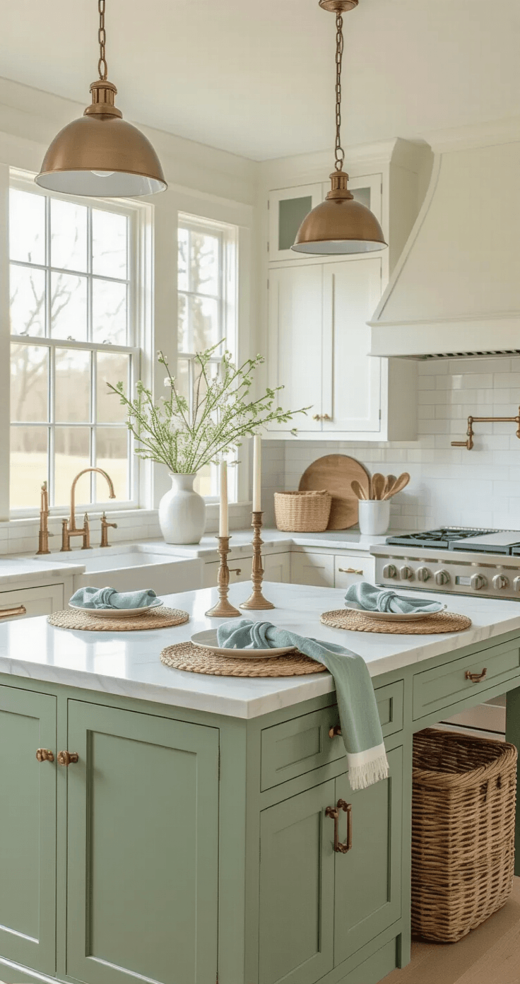
I painted just my kitchen island in a soft sage green last year using chalk paint. Cost me $35 and one Saturday afternoon. Changed everything.
Accent colors for the bold (but not reckless):
- Butter yellow in small doses prevents your kitchen from looking washed out
- Dusty rose adds depth to all those pastels
- Lavender brings unexpected elegance
- Sage green works as both base and accent
The trick is repetition.
Pick one accent color and repeat it three times in different areas.
One lavender dish towel looks random, but lavender towels, a lavender vase, and lavender seat cushions look intentional and designer-level smart.
When you’re feeling brave:
- Coral makes a statement without shouting
- Soft yellow pops against white cabinetry
- Orange paired with blue creates restaurant-quality contrast
These colors shine on cabinetry, kitchen islands, backsplashes, and accessories.
You don’t need to repaint your entire kitchen. One painted island or a colorful backsplash does the heavy lifting.
The Spring Styling Essentials That Actually Matter
Forget the fluff.
These are the items that transform a space from “meh” to “wow, did you hire a decorator?”
💡 Steal This Look
- Paint Color: Sherwin-Williams Alabaster SW 7008
- Furniture: open oak shelving with brass brackets
- Lighting: schoolhouse pendant with milk glass shade
- Materials: unlacquered brass, bleached oak, linen, terracotta, seagrass
I painted my own kitchen cabinets Alabaster last March and the morning light finally felt welcome again—my coffee actually tasted better in that glow.
🌊 Get The Look
Fresh Florals and Natural Elements
Real flowers beat fake ones every single time, but I’m realistic.
Fresh peonies die, and they’re expensive.
Here’s my balanced approach:
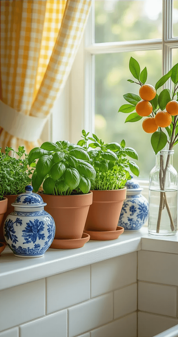
What I keep fresh:
- Herbs in small pots on the windowsill (basil, mint, thyme)
- One stunning floral arrangement when I’m hosting
What I fake strategically:
- Faux tangerine branches in a tall vase (they look surprisingly real)
- Artificial artichokes and pears in a woven basket
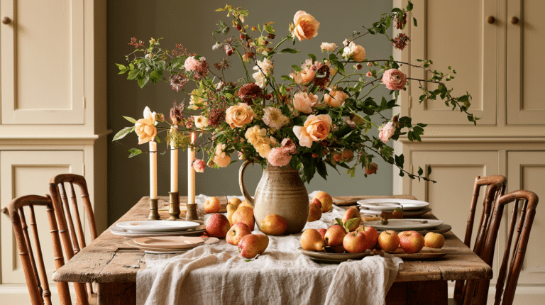
I arranged peonies and ranunculus on a marble tray last Easter. Guests photographed it more than the actual food. The secret was clustering them low and tight, not spreading them out like a funeral arrangement.
💡 Steal This Look
- Paint Color: Benjamin Moore White Dove OC-17
- Furniture: marble pastry slab or cheese board for countertop styling
- Lighting: pendant with seeded glass shade over kitchen island
- Materials: woven seagrass baskets, unglazed terracotta herb pots, matte marble
There’s something quietly luxurious about snipping thyme from your own windowsill while dinner simmers—it’s the kind of small ritual that makes a kitchen feel truly alive, even when the rest of the house is still shaking off winter.
🎁 Get The Look
Accessories Worth Your Money
Not all kitchen accessories earn their keep. These do:
Vases that work overtime:
- Clear glass cylinders (I own three in different heights)
- White ceramic pitchers that double as utensil holders
- Modern ceramic vases in soft colors
Swap those heavy winter crocks for lighter options. The visual weight difference is massive.
Terra cotta everything:
- Pots for herbs
- Planters for decorative arrangements
- Small dishes for salt or olive oil
Terra cotta screams garden freshness without actually requiring a garden.
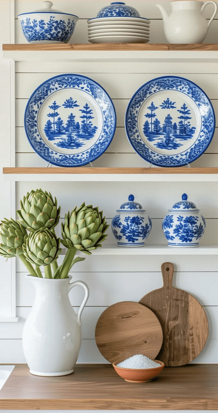
Blue and white classics:
- Chinoiserie ginger jars (even small ones make an impact)
- Blue and white planters
- Delft-style decorative plates
I found three blue and white ginger jars at a thrift store for $12 total. They sit on open shelving and get more compliments than anything else in my kitchen.
Kitchen towels that pull double duty:
- Block print patterns in spring colors
- Floral designs (avoid anything too literal)
- Soft checks in pastels
- Solid colors in your accent palette
I rotate through six towels seasonally. Sounds excessive until you realize they’re visible 24/7 and cost less than one restaurant meal.
Ambiance makers:
- Taper candles in brass or ceramic holders
- Pillar candles in glass hurricanes
- Unscented soy candles (nothing worse than vanilla competing with garlic)
★ Steal This Look
- Paint Color: Farrow & Ball Cabbage White 269
- Furniture: open wood shelving with visible grain
- Lighting: pendant with natural linen shade
- Materials: unglazed terra cotta, clear hand-blown glass, crackle-glaze ceramic
I rotate my kitchen accessories seasonally because it costs nothing and transforms how the room feels to cook in—spring is when I finally let myself use the pieces that feel too delicate for winter’s heavy stews.
The Supporting Cast
These smaller touches complete the transformation:
- Vintage breadboards leaning against the backsplash
- Cafe curtains if your windows feel bare
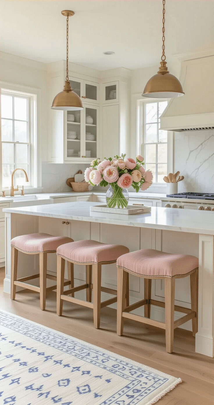
- Light-colored rugs (dark winter rugs make spring styling impossible)
- Simple artwork (one large piece beats three small ones)
- Wall sconces for layered lighting
- Brass hardware and fixtures (they catch light beautifully)
How to Actually Pull This Together Without Looking Like a Pinterest Fail
I’ve made every mistake possible. Too many patterns, clashing metals, florals fighting with florals. Let me save you the trouble.
Start with Neutral and Build Slowly
Your countertops
This post may contain affiliate links. Please see my disclosure policy for details.