Spring Living Room coastal decor: A Complete Styling Guide
Contents
Spring living room decor transforms your space with fresh colors and natural touches, and I’m here to show you exactly how to pull it off without overthinking it.
Last March, I stared at my drab living room and wondered why it felt so heavy when everything outside was blooming. That’s when I realized my space was stuck in winter mode—dark throws, heavy curtains, and zero life.
Sound familiar?

🏠 Steal This Look
- Paint Color: Sherwin-Williams Sea Salt SW 6204
- Furniture: slipcovered linen sofa in a soft ivory or weathered gray finish
- Lighting: driftwood or rope-wrapped pendant light with natural fiber shade
- Materials: weathered oak, seagrass, rattan, washed linen, and matte white ceramic
I learned the hard way that coastal doesn’t mean beach souvenir shop—when I swapped my literal seashell collection for abstract ocean-toned artwork and let the light do the work, my living room finally felt like the fresh, airy retreat I craved each spring.
✅ Get The Look
Why Your Living Room Feels Wrong Right Now
Your couch cushions are flattened. The colors feel tired. Natural light isn’t doing much because your curtains are sucking it up like a black hole.
I’ve been there, and I’m going to walk you through fixing it without spending a fortune or hiring a designer.
Color Schemes That Actually Work for Spring
The Pastel Approach (My Personal Favorite)
I switched to pastels three years ago and never looked back.
Here’s what works:
- Lavender and pale yellow – This combo brought instant calm to my chaotic living room
- Sage green with grey – Sophisticated without trying too hard
- Baby blue with blush pink – Sweet but not sickly
- Pale yellow on its own – Sunshine without the glare
I picked up pastel throw pillows from Amazon last spring, and they’re still getting compliments.
The trick? Don’t go matchy-matchy. Mix two or three pastels and let them breathe against neutral furniture.
The Bold Move (For the Brave Ones)
My sister went this route, and honestly, her living room looks like a magazine spread.
She used:
- Bright coral as her hero color
- Apple green in smaller doses
- Marigold orange through artwork
- Fuchsia in a single statement piece
Orange and blue are opposites on the color wheel, which means they create natural tension that’s actually pleasing to look at. Who knew?
But here’s the catch – you need neutral walls and flooring, or it’ll look like a carnival exploded.
The Goldilocks Strategy (Just Right)
This is what I actually do now.
Start with soft, muted base colors. Then punch in vibrant accents through pillows, books, and small decor.
My winning combinations:
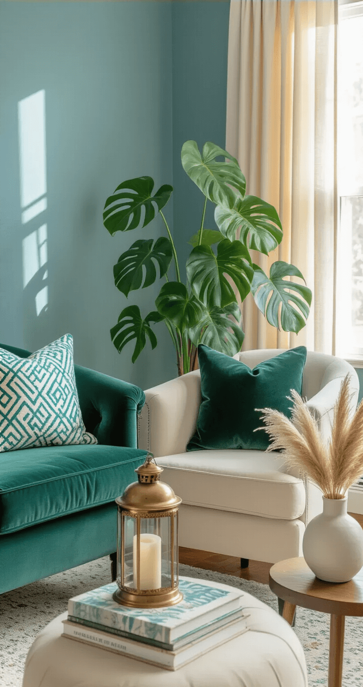
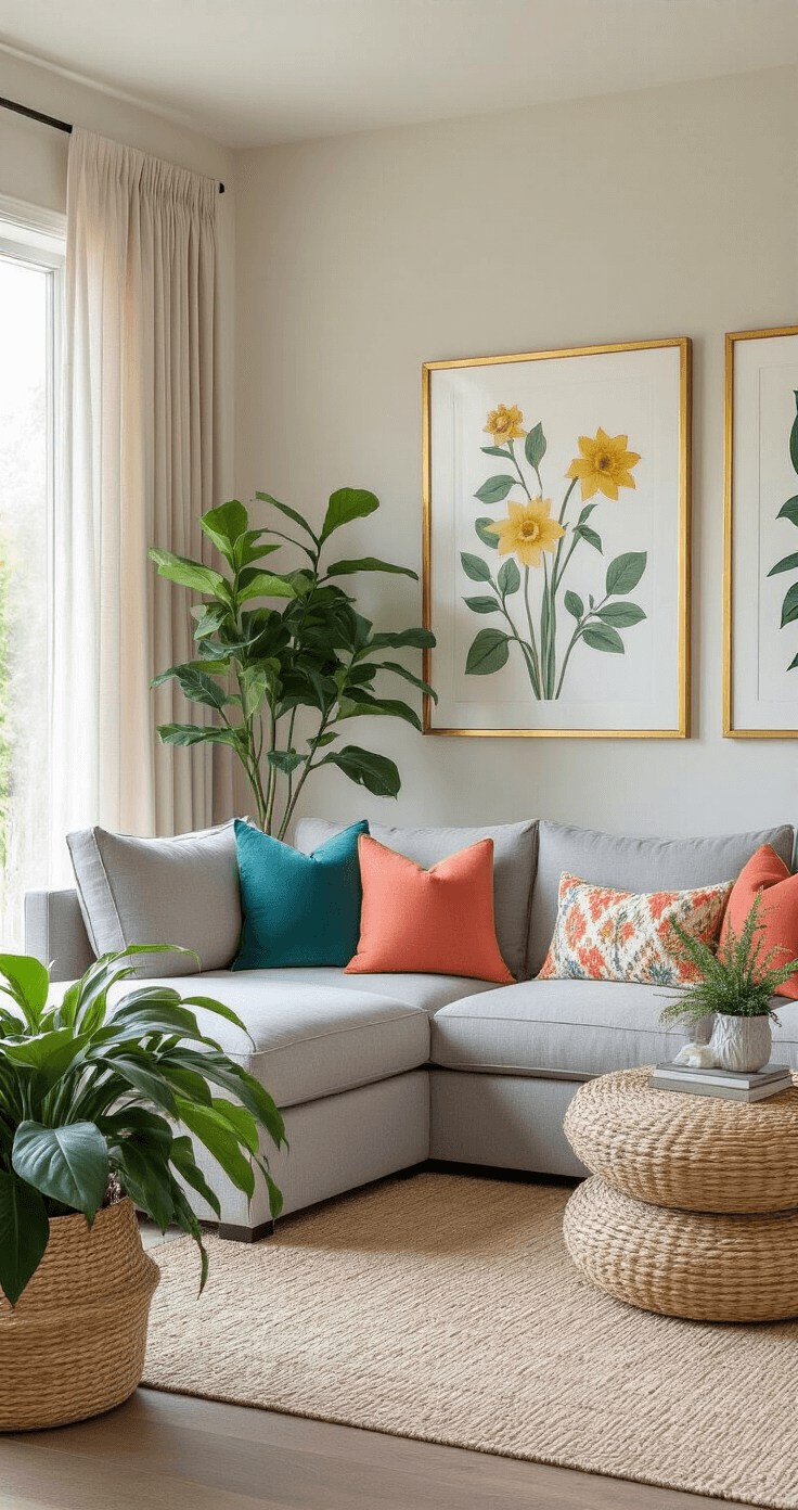
- Teal base + pops of coral and daffodil yellow
- Cream walls + forest green accents
- Dusty blue foundation + aqua accessories
The ratio I follow: 70% soft colors, 30% bright pops.
Works every single time.
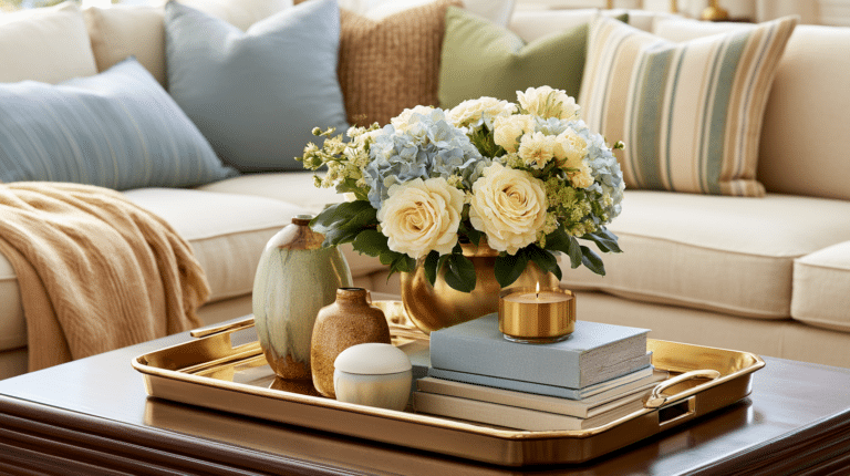
🎨 Steal This Look
- Paint Color: Farrow & Ball Dayroom Yellow 233
- Furniture: linen slipcovered sofa in natural oatmeal with rounded arms and wooden turned legs
- Lighting: ceramic table lamp with pleated linen shade in soft white
- Materials: washed Belgian linen, unbleached cotton, raw oak, matte ceramic, hand-thrown pottery
I learned this the hard way after painting my living room a perfect lavender, then watching it turn clinical against my bright white crown molding. The reprieve came from swapping in cream curtains and adding a single mustard ceramic vase that somehow made everything sing.
The Stuff You Actually Need
Textiles Are Your Secret Weapon
I learned this the expensive way after buying new furniture I didn’t need.
Textiles change everything with minimal investment.
Here’s my spring textile formula:
Throw Pillows:
- Get 4-6 in complementary colors
- Mix patterns (one floral, one geometric, one solid)
- Different textures matter – I combine velvet with linen
I rotate my decorative throw pillows seasonally now, and it’s like getting a new room every few months.
Curtains:
- Ditch the heavy drapes
- Go for light and airy curtains in white, cream, or pale pastels
- Linen or cotton blends let spring light actually reach your furniture
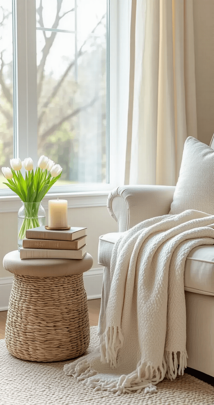
Throws:
- Layer soft wool with linen
- Choose lighter weights than winter
- One draped over your couch changes the entire vibe
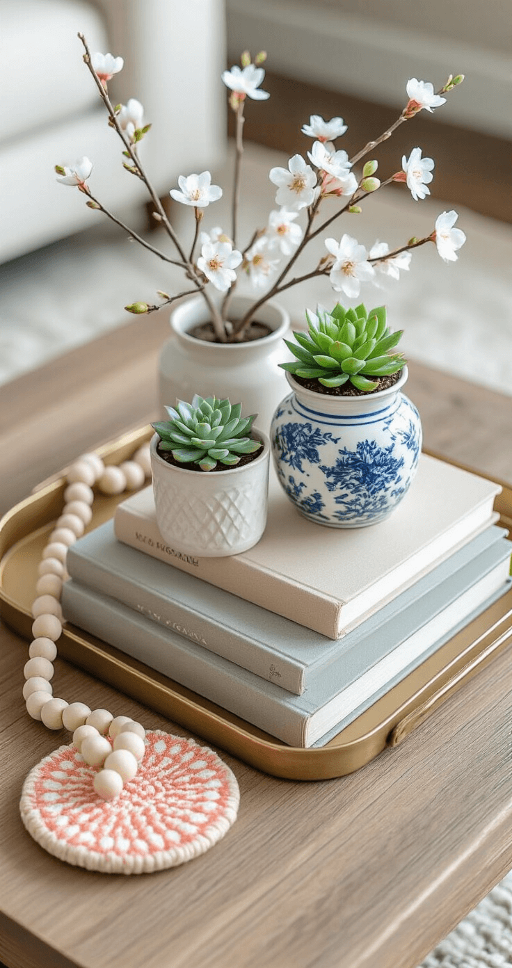
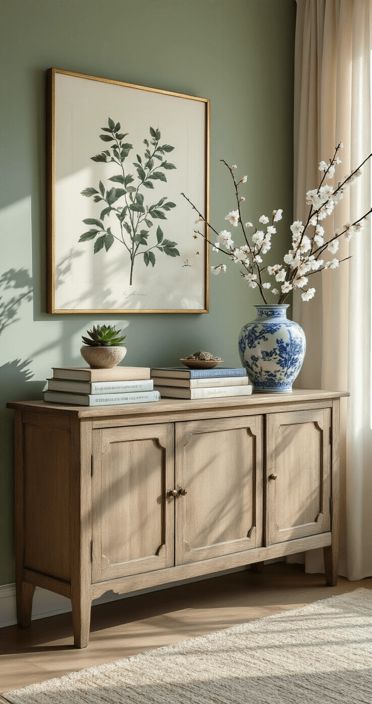
Art and Flowers (The Instagram-Worthy Stuff)
I used to think fresh flowers were wasteful. Then I tried them for two weeks straight.
My coffee table became the spot everyone gravitated toward.
What works:
- Fresh flowers in simple vases (I buy them weekly now – it’s my thing)
- Faux stems if you’re forgetful like my husband (no judgment)
- Botanical prints from Etsy or affordable sites
- Floral artwork that echoes your pillow colors
Pro move: Use blue and white vases. They’re classic, work with everything, and I’ve collected mine over three years from thrift stores.
Grab some artificial flower arrangements if you want the look without the weekly investment.
Natural Textures (The Game-Changer)
This is where spring decor gets interesting.
I added these to my living room last year:
- Woven baskets for storage and texture
- Beaded gar
Conclusion
Refreshing your living room for spring is about more than just adding flowers—it’s about creating a space that feels light, airy, and full of possibility. By incorporating seasonal colors, natural textures, and lighter fabrics, you can transform your space without a complete overhaul. The key is making changes that feel fresh but still reflect your personal style. These simple updates will breathe new life into your living room just in time for the warmer months. Embrace the season of renewal and let your living room reflect the optimism of spring.
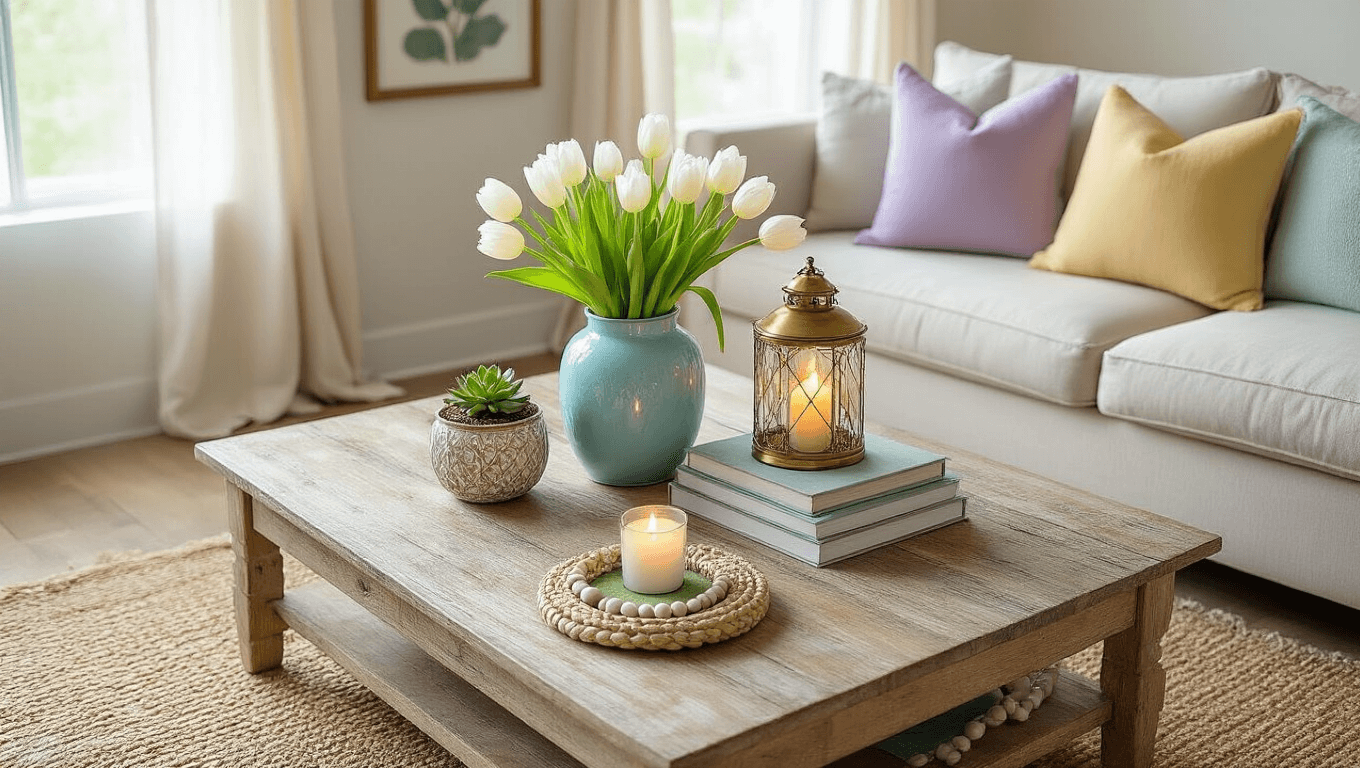
✎ Steal This Look
- Paint Color: Behr Swiss Coffee 12
- Furniture: slipcovered linen sofa in natural ivory
- Lighting: brass pharmacy floor lamp with linen shade
- Materials: Belgian linen, raw cotton, light wool, matte ceramic
I used to think textiles were an afterthought until I realized they’re actually the fastest way to make a rental feel like home without losing my security deposit.
This post may contain affiliate links. Please see my disclosure policy for details.